- Not A Designer
- Posts
- Got some rhythm?
Got some rhythm?
Using a scale to find that vertical rhythm
Today, we’re finding our rhythm — our vertical rhythm — while pulling together a few other tools we’ve explored up to this point. We’re going to dig into how to use a scale to space elements systematically on the page — no guessing (and second guessing) here!
This issue of Not A Designer is brought to you by Erik Kennedy of LearnUI, a REAL designer who used to be an engineer, has created design courses taken by thousands of students, and has his own newsletter, Design Hacks. Make sure to check out his stuff! 🤗
While researching grids and layouts, an interesting term kept on popping up: vertical rhythm. It refers to how the site feels as you move down the page. Like music, does it have a good rhythm, a visual pattern that moves you smoothly and harmoniously downward? Or is it off-beat, with a jump here and a jolt over there?
You can tell when the vertical rhythm is off because your eyes tend to get stuck at different parts of the page. The elements are harder to take in, text is tougher to read, and it just feels bumpy. We want that smooth ride.
Here’s an example of a page with poor vertical rhythm:

It’s not the worst page in the world, but something about it feels just a little off. The subheading feels like it’s floating away from the heading. Its spacing is too wide. The main body text feels too tight. If you feel the same bit of discomfort I feel looking at this page, that’s a sign of poor vertical rhythm.
Let’s see this same example after fixing that vertical rhythm:

That’s much better. I feel like my eyes are flying down the page, not a bump in sight!
So what changed? What’s responsible for that rhythm?
It’s not the font, font weight, and other more obvious styling choices. It’s actually the one thing that’s kind of invisible – the spacing.
If you think about what it takes to lay out a page, there are so many spacing-related decisions we have to make.
Line height? That’s a spacing decision. We’re deciding the height of the space where the text is going to be, which determines how far apart lines of text are from each other.
Margin below that heading? That’s a spacing decision. That determines how far away our subheading is going to be.
The height of that nav bar? Another spacing decision. That decides how much room our title and nav items have to themselves before they go up against a different element.
We’ve tackled line height in a previous issue, so in this drop, we’re going to focus on other forms of spacing.
More specifically, we’re going to continue on our #notadesignernewyear challenge by working through the spacing of a particular part of my personal site redesign – the Projects section.
Getting set up
To start, we’re going to pull together everything we’ve learned so far about layouts and wireframes. In Figma, we’re going to start with our 8px grid and our 12-column layout.
Let’s see what that looks like.

Great! Now we have a structure we can use to help make our first placement decisions.
I’ve got six projects I want to highlight on my personal site. Remember that the first step of wireframing is gathering our content so we know what we’re working with.
For each of my projects, I’m going to have an image, the title of the project, a short description (1-2 lines), and some related stats.
I’m going to start working on my design by simply blocking off each project as a rectangle on the page. I like giving it a red outline so it stands out.

Because I want three projects on each row, each project will take up four columns. The gutter between the columns on my grid gives me built-in margins, so I don’t have to worry about figuring out how far apart my projects should be as we move across the page. That means my first spacing decision is out of the way. Nice!
You’ll notice there are two rows of projects and there’s space between them. Since I don’t yet have a system for spacing those apart, I’ve just eyeballed them for now. We’ll revisit that with a more intentional strategy a bit later.
For this issue, I’m going to focus on laying out only the first project. Then I can copy and paste that style to all the other projects.
Putting things in rows
You might remember from the wireframe issue that we talked about a very helpful idea in laying out content – every row should represent an idea.
So the next thing I’m going to do is represent the different pieces of content as different rows in my project. I’m not going to worry too much about their precise size for now – I’ll approximate that the two lines of the description are bigger than my title and the stats will probably be pretty small.
If we give each piece of content its own row, we end up with this:

Now it’s time to fill in those rows.
The first time I did this, I left the borders red and the background gray, but this actually made it really hard to see what looked good. After I’d finished spacing things out, I removed the border and the background, and things were way too spaced out! Because the borders add their own weight to the layout, they’re hard to design around, so it’s best to get rid of them first.
In fact, it’s a good idea to create a rectangle that’s close to what you actually want it to look like.
I know that I want a light border for my project with some slightly rounded corners and a white background, so let’s get rid of the borders and background and replace them with those style choices. I also made the grid a lighter pink so you can see the gray border better.

Now we’re ready to start placing actual text.
Placing the title
We’re going to start with our title. The first thing we have to do is determine its font size. Luckily, we have a typographic scale we’ve already come up with! We can use the values here to pick our font sizes instead of just making up numbers.
Here it is:

To pick the font size for my title I need to consider two things:
What heading level makes sense for something like a project title?
What’s going to fit all the letters into that small box?
As far as heading levels, the project title isn’t the most important thing on the page. It’s not the heading of the hero, which is usually our biggest font size and would therefore be a Heading 1, and it’s not the title of a section, which might be a Heading 2. So I would put it maybe in the middle, a Heading 3.
Let’s try that and see if that works.

Yikes, that’s too tight! Let’s go down one level.

That’s much better. That gives us some room to breathe.
Now I will note that this is a relatively short title. If my titles go on for three lines, I might come back and reconsider the font size, or try to make the title shorter. But this is a good starting point for now. Once we place all my other content, we’ll learn and iterate from there.
Now the question is, where in that little box should we put it?
Right now, it’s flush against the image and the rectangle’s border and has no breathing room. Not good. We definitely want some margin there. The question is, how much margin?
You could just eyeball it and see what feels right, but let’s see if we can be more intentional.
Is there a system or tool we can use to help us with spacing?
Yes, there is!
We’re going to use the 8px scale to create a set of predetermined blocks that we can use to pick our spacing.
Let’s do a quick recap of the 8px scale.
The 8px Scale
The scale will provide us with spacing guidelines that start at 8px and adds 8px at each step. Since we’re using the scale for spacing, we’re going to create a series of squares with dimensions that are multiples of eight. To save space and make our squares a bit easier to use, after 64px, I’m using multiples of 16. We’re going to use these squares in our design shortly.
Here’s the first half of that scale so you get the idea:

You can keep going as high as you’d like. Tailwind’s spacing scale goes up to 384px!
Now that we’ve got this scale, we can start using it to help speed up our spacing decisions and create that vertical rhythm.
But first, a design break!

I’m super excited about Not A Designer’s January sponsor, Design Hacks, a newsletter run by incredible designer Erik D. Kennedy. Design Hacks helps you create better designs. It features short, original UI/UX tips & tactics. It’s read by over 50,000 people from Apple, Google, Stripe, and more. Check it out here.
Spacing the title
I know I need to add some cushioning around the title – I need to give it space both from the border and from the image.
So how much space should I give it?
Instead of picking a random number, I’m going to pick a number from my scale. I want a healthy amount of space, so I’m going to start with 24px from my scale. That means I’m going to grab my 24px box and put it in all the places where I want that spacing.
Here’s what that looks like:

That looks better, but it’s hard to tell with the boxes and the grid visible. So in Figma, I’m going to hide those tools so I can see how the spacing feels on its own.
Here’s what that looks like:

That actually looks pretty good! In one go, we’re done placing our title!
Now let’s place that description.
Placing the description
Let’s start by picking its font size, once again using my handy dandy typographic scale. This is going to be one of my body texts, so I have only three options (16px, 20px, 24px). I’m going to go with 20px and see how that fits in that box.

That fits pretty well! Once again, having only three predetermined options to choose from for font size made that an easy decision.
Now let’s figure out where to put it.
We want to align the description with the title so we know the spacing between the border and the description will be 24px. Great! All we have to decide is how far away from the title I want it to be.
This is where the proximity design principle comes into play.
Proximity tells us that the closer things are to each other, the more related we believe them to be. So if we want to convey the idea that title and description are related, we need to place them relatively close together. Since we already have them 24px away from the border, I’m going to pick a value less than 24px. Let’s go with 16px and see how that feels.
Here’s what that looks like:

Now let’s get rid of all our tools:

Hm, that feels too far away from the title. Let’s go down one and see how 8px feels.

And here’s without our tools:

Much better! Another spacing decision done!
Now let’s add in our stats.
Placing my stats
I have two stats I want to include for Not A Designer: my subscriber total and my open rate.
Let’s add those in at the bottom:

For our stats, I want to add a bit more styling to them first since that will impact my spacing. I’m going to style them like tags. I’m not going to worry about color for now (that’ll be covered in its own issue), but instead, I’m going to give them a light gray rounded border.
Now the question is, how much padding should I have around each stat? That’s a spacing question that can be solved with our 8px scale!
My tags are pretty small, so I’m going to use the smallest unit I have and go with 8px.
Let’s see what that looks like.

And here’s without my tools:

Hm. That’s ok, but feels too tall. I want that narrow, pill look.
This is where we introduce a new tool to our 8px scale – the 4px block. We’re going to make a square that’s just 4px big that can really come in handy when we’re dealing with smaller elements like labels, icons, and, in our case, tags.
Here’s what our tag looks like with that new 4px spacing.

And here’s without our tools:

Much better!
Now how far apart should the two stats be from each other?
Again, if we use our proximity principle, we want them pretty close together since they’re both conveying the same type of information. So I’m going to pick a conservative 8px and see how that feels.
Here it is:
And here’s without our tools:

Looks good!
Now we have to figure out where to put our tags in relation to our description. How far below it do we want it to be?
Let’s think for a moment. The proximity principle tells us we should be fairly close because they’re related content. However, I would argue that title and description are more closely related to each other than stats – stats are like bonus content. Title and description are the main thing. So I think it’s reasonable to have a bit more space between the description and stats.
The spacing between the title and description was 8px, so let’s make the space between the description and stats 16px and see how that feels.
Here it is:
And without our tools:

That looks pretty good!
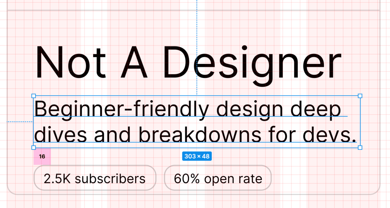
Now there’s one spacing decision left – the space between the stats and the bottom border.
Luckily for me, I can use a previous decision and apply it here. I already decided that the spacing between my top border and my title was going to be 24px and it makes sense to have the spacing surrounding all of my text be consistent. When I code this up, that’ll end up being the value of my padding.
So let’s add 24px of space below my stats and see how that feels. This means increasing the height of my box, which is totally fine – it was an arbitrary height to start with anyway.
Here it is:

And here it is without our tools:

Now that’s got some rhythm!
It looks clean, well-balanced, and, best of all, we didn’t really have to think too hard or rely on our own creativity to lay it out. By using a scale and moving around some boxes, we were able to use predetermined numbers to quickly and easily pick values that create a great looking element.
If you want to use the 8px scale for spacing in your design and are using Figma, no need to create those boxes from scratch – you can use mine right here!
Writing this walk-through took quite some time because I’m breaking down each and every decision, but the process of actually using the scale and then making the spacing decisions took maybe a minute or two.
Using a scale like this is very new to me – I’m used to just eyeballing things and seeing what looks good and feeling very uncertain about my decisions. But picking from that predetermined list made the process so much easier and faster and also came with the added benefit of making me feel confident about my decision. I wasn’t just making things up — I was using a spacing system that is widely used in design by real designers. There’s a huge comfort in doing things the official way.
What do you think of the 8px scale for spacing? Reply and let me know!
Happy designing!
Saron
Reply