- Not A Designer
- Posts
- Elevating the humble checkbox
Elevating the humble checkbox
Three steps to a sleek list of options
As far as defaults go, the default checkbox actually doesn’t look too bad.

Default checklist
It’s clean, has cute little rounded corners, a fun bright blue color – not too shabby!
But with just a few changes, we can upgrade our humble checkbox and make it look a little more elevated.
After reading about styling checkboxes and looking at tons of examples, I found that there were three things most styled checkboxes had in common.
Here’s what designers seem to be doing:
Increasing the size of the checkbox
Giving the checkbox room to breathe
Playing with gray
Let’s do a walkthrough and break it down.
Here’s a screenshot of the kind of settings you might find in an application with default checkboxes.

I’ve done some minimal styling to make this a little more organized. Namely, I:
gave the descriptions a margin-left so that they’re inline with their label
gave each checkbox item a padding-bottom to create separation between the options
Now let’s start elevating.
When bigger is better
One of the techniques I saw over and over was making the actual checkbox bigger. Right now, it’s the same height as the line height of the label, but we want our checkboxes to go beyond that.
So how much bigger should our checkboxes be? For text that’s 18px, it seems like a good size is about 25px. If you’re using Tailwind, you can use the classes h-6 and w-6 to get it to 24px, which is close enough.
When we do this, we want to make sure we center our labels to our checkboxes. Here’s what that looks like:

What I like about making the checkboxes bigger is that it draws the user’s attention to the main activity on the page – checking those boxes! We’re highlighting the primary action on the page, which brings focus to the interface.
Let me breathe!
But now I’m feeling a little claustrophobic. With those boxes taking up more space, it feels like they’re bumping up against everything and could use some more room.
This is probably why so many examples I saw of these larger boxes also came with more padding, giving them a little breathing room. Let’s add some right padding to the checkboxes and see how that feels.

Ah, that feels so much better.
Playing with grays
So far we’ve implemented two out of the three techniques: size of checkbox and spacing. The last one we mentioned was “playing with grays.” Where does that fit in?
That’s referring to the color of my text.
The problem we’re trying to solve is readability. Right now, there’s not a clear delineation between the label and the description. Because they’re the same size, font-weight, and color, skimming just the labels to easily find what you’re looking for is tough.
We could change the font size and make the descriptions a little smaller. We’ve explored the effect of changing font size in previous issues and we found that the change often is more subtle than we need it to be. To really feel the effects of a font size change, the difference between the font sizes needs to be dramatic, and at those levels, it can end up looking a bit obnoxious. So we’re not going to do that here.
The other option is adjusting the font-weight. I could increase the font-weight of my labels and that would certainly help them stand out. Let’s try that and see how it feels.

This definitely helps our readability, but there’s something that’s bothering me.
Increasing the font weight helps the labels stand out by giving them more real estate on the page, but they feel a little too loud, a bit too bold. If I really think about it, it’s not that I want the labels to be louder, it’s that I want the descriptions to be quieter. I want to turn the volume on the descriptions down so they don’t call as much attention to themselves. That’s where color comes in.
Instead of increasing the font weight, I’m going to change the color of my descriptions to a gray and see how that feels.

I like it! By turning down the volume on the description, we make our labels stand out by comparison, making them easier to scan and read.
But before we pick this design, we need to check something super important – our color contrast. This gray looks good to me, but is it accessible to someone with low vision? I’m going to use the Able plugin in Figma that I talked about in my color contrast issue to check.

This gray fails the small text guideline, but because my text is bigger, I’m in the clear. Great, I think I’m all done!
Let’s do a quick before and after.

What do you think?
What I like about these changes is that they’re relatively small and subtle, but the result is a sleeker, more polished looking checklist.
There’s more we could do – we could get fancy and change the color of the checkbox, give it a fun border, maybe even add an animation when it’s clicked. But even without doing all of that, we’ve created something that’s a bit more thoughtful and easy to incorporate in your next project.
Checkboxes IRL
Here are some examples of checkboxes in the wild that use similar techniques but are slightly different.
This one is from GitHub’s profile page where there’s a long list of settings, options, and lists.

Checkboxes in GitHub
The biggest differences are that they went with increasing the font weight and not much spacing. I don’t know about you, but I think we could use a bit more spacing in this one.
This is from Gmail’s settings.

Checkbox in Gmail
Here we see that bigger checkbox with another example of increased font weight. What’s also interesting about this one is that they put the description inline with the label instead of beneath it. Interesting choice!
This one is from Instagram’s settings.
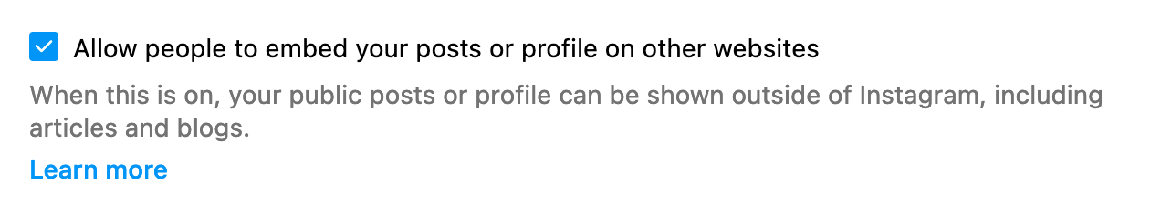
Checkbox in Instagram
We see the use of the larger box and the grays, but the description isn’t flush with the label, which I found a bit surprising.
So how can you elevate your checklists?
Make the checkbox bigger than your label’s line height. If your label is 18px, pick a checkbox that’s at least 25px tall.
Add right padding. Give that big checkbox room to breathe.
Use a gray for the description. This makes your list more readable, but make sure the gray you pick is accessible by using a tool to check the contrast.
Happy designing!
Saron
It’s super validating to hear your thoughts on the newsletter. Thanks for the shoutout, Dan ❤️

Reply